Award-winning design focuses on visitor behaviour rather than just visual appeal. When that focus is missing, bounce rates stay high because visitors can’t quickly find what they need. Those sleek animations and trendy layouts may impress other designers, but they often hide the main information people actually came for.
Frankly, visually appealing websites may win awards, but websites built for usability generate more customer enquiries. The difference often comes down to clarity (not creativity). That’s because design choices either guide people toward contact forms or leave them confused and clicking away.
This article explains how user-focused design reduces bounce rates, improves engagement, and converts more visits into leads. You’ll also see which design patterns work and what common mistakes push people off your site.
Let’s get into it.
What Design Behaviour Means for Your Bottom Line

Design behaviour controls how visitors interact with your site and complete desired actions. So you’re not just arranging pixels here and hoping for the best.
Here’s what actually moves the needle for your enquiries:
- Button Colour vs Placement: Where you place a call-to-action on the page counts more than which shade of blue you choose. Many designers focus on colours while ignoring placement, which has a negative impact on clicks.
- F-Pattern Scanning: Visitors scan your content in an F-shaped pattern, reading the top and left side before drifting down the page. If you bury your contact form at the bottom, most people will never see it before clicking away.
- Load Speed Impact: Three-second delays cost you half your potential enquiries before your content even loads. That’s because visitors decide whether to stay based on how quickly they see something useful instead of how pretty your hero image looks.
- Form Length: Visitors generally abandon a form asking to fill out ten fields because they won’t commit five minutes to a business they’re still evaluating. Instead, the three-field version performs better since it requires less effort.
- Navigation Clarity: Confusing navigation pushes prospects away. But a clear, well-organised menu helps users find what they need without frustration.
Quick tip: Test one behaviour change at a time so you know what’s actually working.
Now, let’s look at how these principles translate into layouts that actually convert.
Layout Choices That Drive Clicks and Enquiries
Smart layouts often lead to higher enquiry rates within weeks. Layout usually determines what visitors notice first and what they ignore completely. Therefore, poor structure can convert your qualified prospects into bounce statistics.
Let’s have a look at how layout decisions influence visitor behaviour and conversion outcomes:
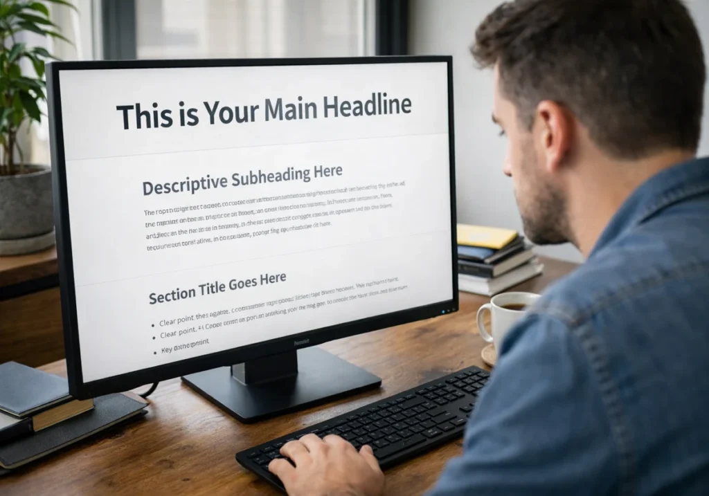
Visual Hierarchy: Guiding Eyes to Action
Your most important message gets skipped when everything on the page looks equally prominent. Visitors generally scan rather than read, so you need clear priority signals built into your design.
In this case, bold headlines pull attention first, then subheadings guide readers through supporting details, and body text fills in the complete picture only after those anchors do their job. That sequence follows natural reading behaviour, which means your layout works with human instinct rather than against it.
When contact buttons get lost in busy backgrounds, users overlook them, regardless of how functional they are (we’ve all seen that mistake). But high-contrast colours and generous padding around action elements fix this issue quickly.
Keep in Mind: If your call-to-action button blends into surrounding content, visitors treat it like decoration rather than an opportunity.
White Space and Scanning Patterns
People skip dense text blocks entirely while reading spaced paragraphs completely through. The difference comes down to perceived effort before a single word registers.
Believe it or not, people process content more easily when there’s space between sections. This breathing room lets visitors understand one idea before moving to the next.
Crowded layouts also make visitors work harder, so they leave for cleaner competitor sites. Meanwhile, white space reduces cognitive load, which directly impacts how long someone stays on your page.
With that foundation in place, you can start building trust through clarity rather than overwhelming detail.
Build Trust Through Design Clarity
Have you ever noticed how some websites feel instantly trustworthy while others raise red flags? Well, the reason is that visual choices communicate your professionalism before visitors read a single word. To be more specific, design clarity separates businesses that convert from those losing leads by the minute.
Check out what clear structure and readable content do for your first impression:
How Navigation Structure Signals Credibility
Menus with eight items usually feel overwhelming, while people tend to explore fully five clear options.
In fact, hidden navigation menus force visitors to hunt for basic information like your phone number. When potential customers can’t find your contact details within three clicks, they assume you’re hiding something or simply not serious about your business.
Additionally, logical category labels work better than creative names that leave people guessing your meaning. In our work with professional website design projects across Australia, we’ve consistently found that clear navigation with five focused items produces higher engagement than clever but confusing alternatives.
Therefore, your visitors should never wonder where to find pricing, services, or how to get in touch.
Content Readability and Professional Perception
Tiny fonts make your website look outdated even when your services stay completely current. It signals you haven’t updated your approach since 2010 (and prospects notice that disconnect immediately).
Similarly, wall-to-wall text suggests amateur hour, while breathing room signals professional polish. This first impression decides how visitors judge your credibility. That’s why breaking dense paragraphs into scannable chunks with clear spacing improves how your site is perceived.
Frankly, industry jargon only impresses peers but confuses actual customers trying to buy from you. Such a gap creates hesitation, and hesitation kills sales faster than poor pricing ever will.
Measuring Real ROI from User Experience Design
Behaviour-focused design works best when you measure real user actions instead of relying on opinions. Actions always reveal true performance.
The following things count the most when measuring design performance:
| Metric | What It Reveals |
| Time-on-page | If the content holds attention or allows immediate exits |
| Click-through rates | Which elements visitors actually notice versus ignore completely |
| Form completion rates | Exact points where potential customers abandon your enquiry process |
To be more specific, these metrics connect directly to business outcomes you can measure in dollars. From our practical knowledge working with conversion-focused web design, we’ve seen how improving form completion from 15% to 25% translates to real revenue growth.
From here, you’ll see how to apply this measurement approach to your own site.

Start Designing for Behaviour Today
Now you can see why visually impressive designs fail while behaviour-focused layouts generate business. The difference shows up in real metrics rather than just opinions or guesswork.
Small layout adjustments create measurable improvements in enquiries within weeks of implementation. That’s why your next website update should prioritise user paths over visual trends and aesthetics.
Plugins Electronix designs websites that guide visitor behaviour and deliver measurable business outcomes for Australian businesses. Contact our team to discuss your site’s performance goals and build layouts that turn traffic into enquiries.